Palette
Typography
Summary
Offcut is a promo-code manager for small shops that sell through more than one storefront. This is the whole website, not a screen of it: a public landing, sign-up and sign-in, and twelve app screens sharing one shell, opened as one page and walked with the nav. The shop inside is a two-person ceramics studio with twenty-five codes, three storefronts and ninety days of redemptions, so every table sorts, every filter removes rows, the chart moves when the range changes and the free plan has actually hit its cap. The shell stays; only the screen changes.
Style
Warm paper with a white working surface, one persimmon accent, and a monospace for the codes themselves.
Ground is warm paper #faf7f2; the working pane, cards and inputs are white #ffffff with 1px borders #e9e3da (stronger #d9d2c7 on hover) and 12px corners on cards, 8px on inputs and buttons, 6px on small controls. Ink is #3d3934, headings and primary text #1a1714, secondary #77706a, placeholders #a39d96. One accent, persimmon #e8542f (#c9431f pressed), used only for the active nav item, the chart, the capped usage meter and the upgrade button; primary buttons are ink-black #1a1714 on white, never the accent. Status colours are quiet washes: green #2f8f5b on #e3f3ea, amber #c98a1b on #fcf1dc, red #cf3a2c on #fbe6e3, grey for paused. Type is Instrument Sans 14px/1.43 for everything, 18px/600 for screen titles, 32px/600 for stat values; JetBrains Mono 13px/500 for every code string, count and slug, because the code is the product and mono makes it a thing you copy. Shadows are near-invisible: 0 4px 12px rgba(26,23,20,.05) on the pane, a deeper 0 16px 40px -12px rgba(26,23,20,.25) only on menus and the sheet. No gradients except the conic swatch of the shop avatar and the faint radial wash on the auth screens. Durations: 75ms for hover colour, 150ms for state changes, 200ms for menus and toasts, 300ms for the sheet, easing cubic-bezier(0.16,1,0.3,1) for anything that enters.
Layout & structure
A public landing, two auth screens, and one shell — rail, sidebar, white pane — with twelve screens inside it, all switched by hash without leaving the page.
Landing
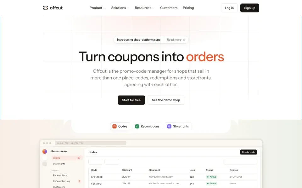
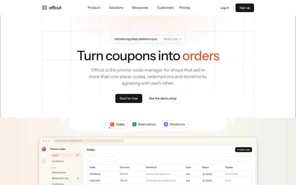
The public front door, built to the original's structure: a 1032px column with 1px side rules the whole way down and full-bleed rules between sections. A 76px white sticky nav — wordmark, Product / Solutions / Resources with chevrons, Customers, Pricing, Log in, black Sign up — where the three buttons open mega-menus on hover or click: Product is three tall product cards on gridded paper with a live miniature in each and a two-cell row for Integrations (tile strip) and API (code snippet); Solutions is three columns (use case, stage, SDKs) of icon rows; Resources is three columns plus a paper strip with a NEW badge and a logo marquee. A centred hero on a faint 140px grid that fades out, with a two-part announcement pill, a 64px/500 headline with one accent word, a 22px lead and two CTAs. A paper band opens with a white tongue (concave corners) holding three product pills that switch a large browser frame of the app (masked to fade at its foot) under a dark caption card; the pills auto-rotate every six seconds with a progress line, pausing under the pointer. A logo cloud, five by two with CASE STUDY labels, that flips to a second set every five seconds. A manifesto on dotted paper: 30px grey sentences that turn ink as they cross the middle of the viewport, three highlighted words with coloured product chips, eight tilted floating cards drifting on scroll. Four product pillars — Codes, Redemptions, Integrations (tilted tile grid on gridlines), Storefronts — each with eyebrow, 52px/500 headline, lead, secondary CTA and a visual: stacked storefront cards fading and offsetting; a checkout mock feeding a three-colour funnel with a Play demo pill; a sync stat card, dark synced pill, tilted invoice and a fading list of orders. Every pillar ends with a three-column feature row whose 2px accent bar and ink follow the pointer, and a dotted testimonial band. Then Built to scale: headline and lead left, three uppercase-labelled stats in orange mono that count up on first sight, a dotted halftone globe with land masses and pinging accent dots clipped at the right, and a stack of three live event cards (new order, new customer, new redemption) that rotate in. An API pillar with a node diagram — the brand box, a Code redeemed event node under a green New event tag, wires with travelling dots to the storefront cards on the right, dashed drops to three service tiles — then its feature row and testimonial. A customers bento: centred headline, a four-column grid of 1px cells mixing logo cells (short domain revealed on hover) and two-column quote cells with bold spans, product tags, name, role and initials. We ship fast: italic headline left, a timeline of five dated changelog entries fading out downward. A dark closing band with a white tongue at its top, faint grid, orange glow, two CTAs and three review badges. A six-column footer with social icons. Under 1080px the nav links and mega-menus go and a hamburger opens a plain full-width menu under the bar — Product, Solutions, Resources in three columns, Log in and Sign up beneath; under 640px one column, Log in only in the menu. The landing itself still scrolls the document at every width: the hero's CTAs stack, the tongue and the showcase frame shrink to the phone (the frame goes 4:3, the miniature loses its rail, the caption drops below it), the logo cloud goes three then two across, the manifesto loses its floaters, the pillars' stacked cards keep smaller offsets, the globe survives on the tablet low and to the right and goes on the phone, the API diagram survives on the tablet and goes on the phone, the bento goes two then one across, the footer two then one.
Shell
Three columns on the paper ground: a 60px rail (brand mark, shop avatar, two app icons, rewards, help, account menu at the bottom), a 240px sidebar, and a white pane inset 8px with a 12px radius, a 1px border and the soft shadow. The pane holds the screens; everything else stays put. The sidebar has two variants: the product nav (Codes, Storefronts; Insights: Redemptions, Redemption log, Customers; Library: Collections, Tags, Campaign templates) and the settings nav (a back chevron, then Shop, Developer, Account groups). Both end in the same footer: a Usage block with two meter rows (redemptions 245 of 1K, codes 25 of 25 in accent because the cap is hit), the reset date, and a full-width black Upgrade button. Under 1080px the sidebar becomes a 280px drawer beside the rail — a menu button leads every screen bar, a veil sits behind it, a link or Escape closes it, and the router closes it on every screen change. Under 640px the rail turns into a 52px top bar (wordmark, shop dot, the two section icons, the account avatar with its menu opening below) and the drawer hangs under it, full height.
Screen bar
Every screen opens with a 64px bar: 18px/600 title with an optional help icon or view switcher, then the primary action on the right — Create code with a C key chip, View log, or a kebab. Below it the body scrolls on its own with 20px/24px padding and 90px of bottom room for the floating pager. On the phone the bar wraps: a 16px title and a 36px action that drops to a second line, right-aligned, when the title is long; the key chip is hidden. Tables become card rows there — the first cell and the row menu on the first line, the other cells wrapping under it in 13px — while on the tablet the table scrolls sideways inside its card with the first column sticky. The pager spans the phone's width and the setup pill is gone; on the tablet the pager sits left so the pill keeps its corner. The create sheet fills the pane on the phone.
Codes
Toolbar: Filter dropdown (status radios), Display dropdown (column checkboxes), a 256px search on the right, a kebab. A bordered table card: Code (mono, copy button on hover), Discount, Storefront, Uses (mono), Status badge, Expires, row menu. Sortable headers carry a dotted underline and an up-down glyph. Twenty per page; a floating pager card at the bottom centre reads Viewing n codes with Previous / Next. A search with no match hides the table and shows the empty state: three stacked coupon tickets drawn in CSS, a title, one sentence, Create code and Clear search.
Storefronts
Two tabs (Connected / Default), search, an Active / Archived segmented control and a black Add storefront dropdown. A dismissible green-grid banner offering a shop-platform connection. Then a list of row cards: circular globe icon (green wash when verified), the domain with a Verified or Pending DNS badge, a codes count, Manage or Verify, a row menu. A static pager line closes it.
Redemptions
Toolbar: Filter, a date-range dropdown with keyboard hints (24 hours, 7, 30, 90 days), View log, kebab. A three-cell stat strip (Redemptions, Revenue, Avg. order) with a coloured square before each label, 32px values, chevron pucks between cells and a 2px underline on the selected one. The chart card sits directly under it, sharing the border: a 1000×360 SVG with dashed gridlines, five y ticks, dated x ticks, an area fill fading from the accent, a 2px accent line, a line/bar toggle top-right, and a hover cursor with a dark tooltip. Two panels below, each with tabs in the head, a sub-row of pills on paper, and a ranked bar list where a pale accent bar grows behind each row to its share.
Redemption log
The same table card: When (sortable, newest first), Code (mono), Customer (initial avatar in a hue of its own plus email), Storefront, Order amount (sortable). Thirty rows, twenty per page, search on code or customer.
Customers
Filter plus a search by email or name. Table: Customer (avatar + email), Country (flag + name), LTV in euros with a faint EUR, Created (sortable, newest first), Redemptions (mono, sortable). Forty rows, paged.
Collections
Search and a Create collection button with the C chip, then a bordered card holding only the empty state — tickets illustration, No collections yet, one sentence about grouping by launch or channel, two buttons — and a static pager reading Viewing 0 collections.
Tags and Campaign templates
Tags is a three-column table where each tag is a coloured pill (dot plus name in its own hue on a 10% wash) with code and redemption counts. Campaign templates is a two-column grid of cards: a round icon, the template name, and three flat badges reading source, medium and campaign with mono values.
Settings — General
A stack of settings cards, 28px apart: white body with a 16px/600 title, one line of grey explanation and a 536px-max input; a paper footer with the constraint on the left and a Save changes button on the right. The logo card puts a 112px dashed-circle upload target on the right of the text. A select for default currency. The last card is the danger card: pink border, pink footer, red Delete shop button.
Billing
One tall card. Header: Free plan, the billing cycle, Upgrade in accent and View invoices. Two meter cards side by side, the selected one outlined in ink: an icon, a label, a 28px value, a 4px track with the fill, and a remaining line — the codes meter is full, its fill and its footer in accent. Under them the same toolbar and ranked bar list as Redemptions, split by storefront. A four-column limits grid closes the card: icon, label, value / limit with the limit in faint ink.
Sign in and Sign up
Two columns without the shell. Left: a faint 72px grid with a warm radial wash at the top, fading out downwards; the wordmark at the top; a 448px form — title, Work email, a black submit that enters the shop with or without an address, an OR rule, two secondary buttons with icons, a swap line, and a dotted-paper note box for the partner account; legal line at the bottom. Right: a paper panel with a customer-story image card — a drawn studio scene (shelves of pots, a lit window, a wheel) in a 16px-radius dark frame with the shop's logo badge top-left — a 24px headline, a grey Read more button, and a three-by-two logo cloud.
Special components · 9
Hash router with view transitionTwelve screens in one document; the sidebar links are real anchors.
Twelve screens in one document; the sidebar links are real anchors.
Every screen is a section with an id and a hidden attribute. On hashchange, read the id, show that one, mark the matching sidebar link aria-current, swap the sidebar variant the screen declares, and run the screen's setup hook once on first show. Wrap the swap in document.startViewTransition when available so the pane cross-fades in 150ms; auth screens add a body class that hides the shell entirely. Screens are real DOM, not templates, so any one of them can be lifted out later by id. Navigate by location.replace, never by assigning the hash or letting an anchor push: the preview lives in an iframe inside a sheet whose close is one history.back(), and an iframe's pushed hashes join the browser's history, so the back would step through the screens instead of closing the sheet. One document click handler turns every in-page anchor into a replace.
Create-code sheetA 520px panel slides in from the right over the pane, opened by button or the C key.
A 520px panel slides in from the right over the pane, opened by button or the C key.
Absolutely positioned inside the pane, 8px from its edges, translated fully off to the right until a body class brings it in over 300ms with cubic-bezier(0.16,1,0.3,1); a veil at 18% ink fades behind it. Fields: code with a Generate button, a Percentage / Fixed / Free-shipping segmented control that changes the value unit, storefront select, expiry and usage limit, tag chips that toggle, collection select. Escape or the veil closes it. Submitting prepends a real row to the codes table, bumps the usage meter and shows a toast.
Table controllerSearch, status filter, column toggles, sort and paging on plain HTML rows.
Search, status filter, column toggles, sort and paging on plain HTML rows.
Rows carry their sortable values as data attributes. One controller per screen: live search on row text, a status filter driven by radio menu items, column checkboxes that hide every cell with a matching data-column, header buttons that sort numerically or lexically and flip direction, and a page size that slices the filtered set. It counts into the pager, disables Previous / Next at the ends, and swaps the table for the empty state when nothing matches.
Redemptions chartAn inline SVG line or bar chart drawn from a 90-day series, re-sliced by the date-range menu.
An inline SVG line or bar chart drawn from a 90-day series, re-sliced by the date-range menu.
Keep the series as an array in the page. On draw, slice the last n days, scale to a 1000×360 viewBox with a 40px left gutter, and write the gridlines, ticks, an area path closed to the baseline and the line path (or bars at 60% of the step). On mousemove, snap to the nearest index, move a dashed cursor line and a ring marker, and position a dark tooltip above the point. Changing the range redraws and recomputes the three stats.
Popover menusOne pattern for filter, display, range, kebab and account menus.
One pattern for filter, display, range, kebab and account menus.
A trigger with data-menu names its menu by id. Click toggles it and closes every other menu; click outside or Escape closes all. Menus are 220px cards with 6px padding, a 12px radius, the deep shadow, and a 200ms scale-and-fade from the top-left corner. Items are 40px rows with an icon, a label, an optional keyboard hint on the right, and an accent tick when checked.
Empty-state ticketsThree stacked coupon tickets in pure CSS, the top one in accent.
Three stacked coupon tickets in pure CSS, the top one in accent.
Three 180×56 white cards centred on top of each other with 34px offsets, each with a ticket icon, a rounded grey bar and semicircular notches cut from both sides with clipped pseudo-elements; the back two are scaled down and faded, the front one carries an accent bar and a sparkle icon.
Setup pill and checklistA black pill bottom-right with a conic progress ring; click opens a task card.
A black pill bottom-right with a conic progress ring; click opens a task card.
The ring is a 16px conic gradient from the accent to a quarter-white, masked by an inner dot. Clicking the pill toggles a 320px card above it with a title, a sentence and three task rows with circular checkboxes; ticking one updates the ring, and finishing all three hides the pill and toasts.
ToastsStacked bottom-right, above the setup pill.
Stacked bottom-right, above the setup pill.
White 13px cards with a green check, entering with a 200ms rise-and-fade and leaving after 2.6s with a short fade-down. Used for copy, create, save and sign-in.
Landing machineMega-menus, auto-rotating showcase, logo flip, read-along manifesto, parallax floaters, pointer-following feature rows, count-up stats, live event feed. Under 1080px: a hamburger menu instead of the mega-menus, and a drawer instead of the sidebar.
Mega-menus, auto-rotating showcase, logo flip, read-along manifesto, parallax floaters, pointer-following feature rows, count-up stats, live event feed. Under 1080px: a hamburger menu instead of the mega-menus, and a drawer instead of the sidebar.
The landing scrolls the document itself — the shell is display:none while it is up, html and body go overflow:visible and height:auto — because an inner scrolling div inside a sandboxed iframe gets too little raster-ahead in Chrome and checkerboards on fast flings. Observers and scroll listeners use the window. Mega-menus: three nav buttons with data-mega open their panel on mouseenter or click (aria-expanded, chevron rotates, grey pill on the button), close on nav mouseleave after 160ms, on Escape, on a trusted click outside, or on scroll — synthetic clicks are ignored, because the showcase rotation clicks its own tabs. Showcase: three pills toggle three pre-rendered miniature screens in one frame and rewrite the dark caption; a 2px progress line under the active pill runs for six seconds, then the next tab is clicked; hovering the band pauses both. Logo cloud: every five seconds the ten names blur-and-shrink out with a 40ms stagger, the set swaps, the new ten blur in. Manifesto: an observer with -28% top and bottom margins marks each paragraph is-read while it sits in the middle band; floaters translate from the container's scroll relative to the section. Feature rows: mouseenter moves the accent bar and the ink to that column and it stays. Built to scale: one observer fires once at 30% visibility — each stat counts up over 1.8s with a cubic ease on a 32ms timer (not requestAnimationFrame, so it runs in background tabs), and the event feed prepends a card every 2.6s, trimming beyond three with a fade-out and a deferred remove — never a loop that waits on the DOM. Wires in the API diagram move their dot with a transform, never with left. Sticky nav gains its border past 8px. Nothing is hidden until scrolled to: every section is visible the moment it is on screen; the only scroll-linked change is the manifesto's ink. In-page anchors are home- hashes the router maps back to the landing and scrolls into view. Under 1080px the nav links are gone and a hamburger toggles a plain panel under the bar: open on click, closed by a link, a trusted click outside, Escape, a scroll, or the router. The app's sidebar becomes a fixed drawer beside the rail (under the rail's top-bar form on the phone) with a veil; a menu button in every screen bar toggles a body class, and the router clears it. Every responsive rule lives in a media query — 1080px for the tablet frame, 640px for the phone frame — and the landing keeps scrolling the document in both.
Notes
Keep the shell and the machine when adapting: the router, the table controller, the sheet and the menus carry no brand and are the expensive part. Turn the brand — paper, ink, accent, the two type families, the shop and its words — freely. Every interaction has a keyboard path: C opens the sheet, Escape closes sheet and menus, sortable headers and menu items are buttons. prefers-reduced-motion collapses every duration and skips the view transition. The preview is one standalone file: no build step, no runtime fetch, fonts from one host, everything else inline.
Meta
- Author
- Silvio Luchetti
- Published
- today
- Remixes
- 0
- Views
- 0