


Palette
Typography
Summary
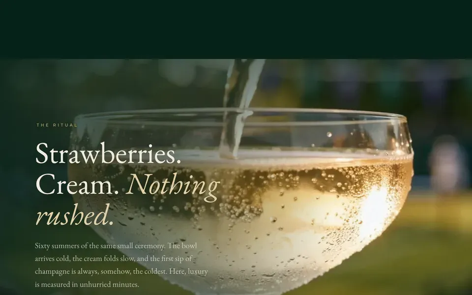
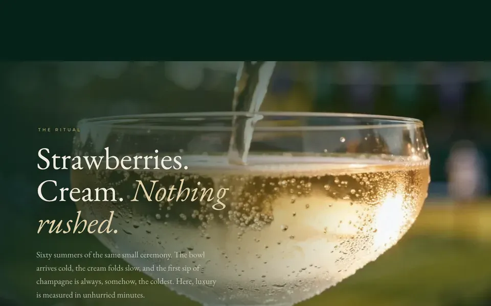
Tre pannelli a schermo pieno con lo stesso impianto e tre allineamenti diversi — testo a sinistra, a destra, al centro. Sotto ciascuno un video che parte solo quando entra in vista e si ferma quando esce, con una deriva di parallasse; sopra, uno scrim sfumato dal lato del testo, che è l'unica cosa che tiene leggibile una serif chiara su un filmato che cambia. Perché conta: è il mattone con cui si costruisce una landing cinematografica. Tre volte lo stesso pannello e la pagina non si ripete, perché a cambiare è da che parte guardi.
Style
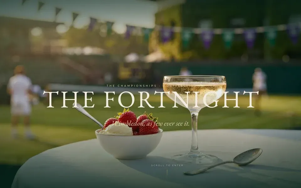
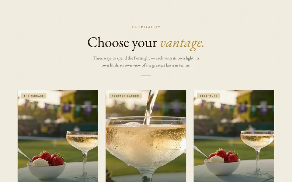
A printed championship programme rendered as a film: editorial serif over full-bleed footage, gold hairlines, and a permanent grain over everything.
Two palettes doing two jobs, never mixed. INSTITUTION, used for frames, bars and dark grounds: deep green #06231a, green #0a3d28, brand green #007649, deep purple #241238, purple #3d2360, brand purple #593987, light purple #b39ddb. LUXURY, used for every surface the reader actually sits on: cream #f7f1e4, soft cream #efe6d3, champagne #e7d6ac, gold #b8933f, light gold #d6b464, deep gold #8f6f28. Ink is #23180d, softened to 68% for body and 42% for captions; on dark grounds the chalk is #f7f1e4 at 72%. Gold is a hairline and a rule, never a fill — no gold buttons, no gradients on type. Two typefaces with separate jobs: EB Garamond (standing in for A Caslon Pro) for every display line, every pull quote and every price, italic for the second half of a headline so the sentence turns; Montserrat (standing in for Gotham) for eyebrows, labels, nav and form, always uppercase at 0.28–0.4em tracking, never above 12px. Headlines run on clamp() from 22px to 34px for the loader word and up to 1.02 line-height at section scale — set them by viewport, never at a fixed size. Gutter is clamp(22px, 6vw, 120px) and holds on every section. One easing everywhere: cubic-bezier(0.22, 0.61, 0.24, 1). A film-grain layer sits above the entire document at low opacity and shifts its background position on a timer, so the page is never perfectly still.
Layout & structure
Una sola sezione, presa dalla pagina a cui appartiene.
La sezione
Tre pannelli a schermo pieno con lo stesso impianto e tre allineamenti diversi — testo a sinistra, a destra, al centro. Sotto ciascuno un video che parte solo quando entra in vista e si ferma quando esce, con una deriva di parallasse; sopra, uno scrim sfumato dal lato del testo, che è l'unica cosa che tiene leggibile una serif chiara su un filmato che cambia.
Notes
Perché conta: è il mattone con cui si costruisce una landing cinematografica. Tre volte lo stesso pannello e la pagina non si ripete, perché a cambiare è da che parte guardi.
Meta
- Author
- Silvio Luchetti
- Published
- yesterday
- Remixes
- 0
- Views
- 0